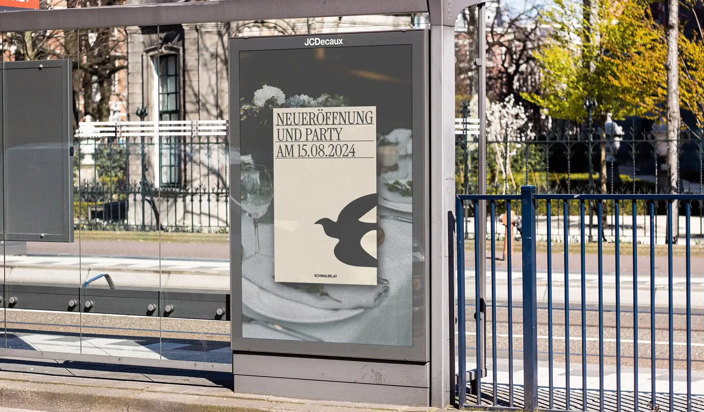
Rebranding: DAS SCHWALBENNEST
REDESIGN
COLOUR COMBINATIONS
FONT GUIDELINES
ILLUSTRATIONS
PHOTOGRAPHY GUIDELINES
SOCIAL MEDIA CONCEPT
MERCHANDISE DESIGN
A fictional branding I did during a course thaught by Illya Pavlov from Grafprom.
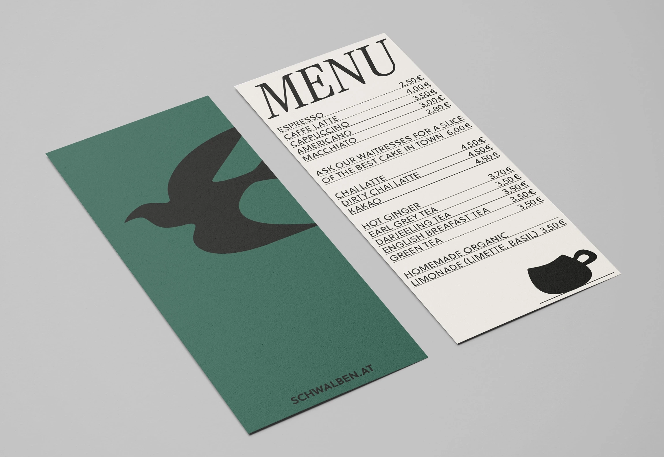
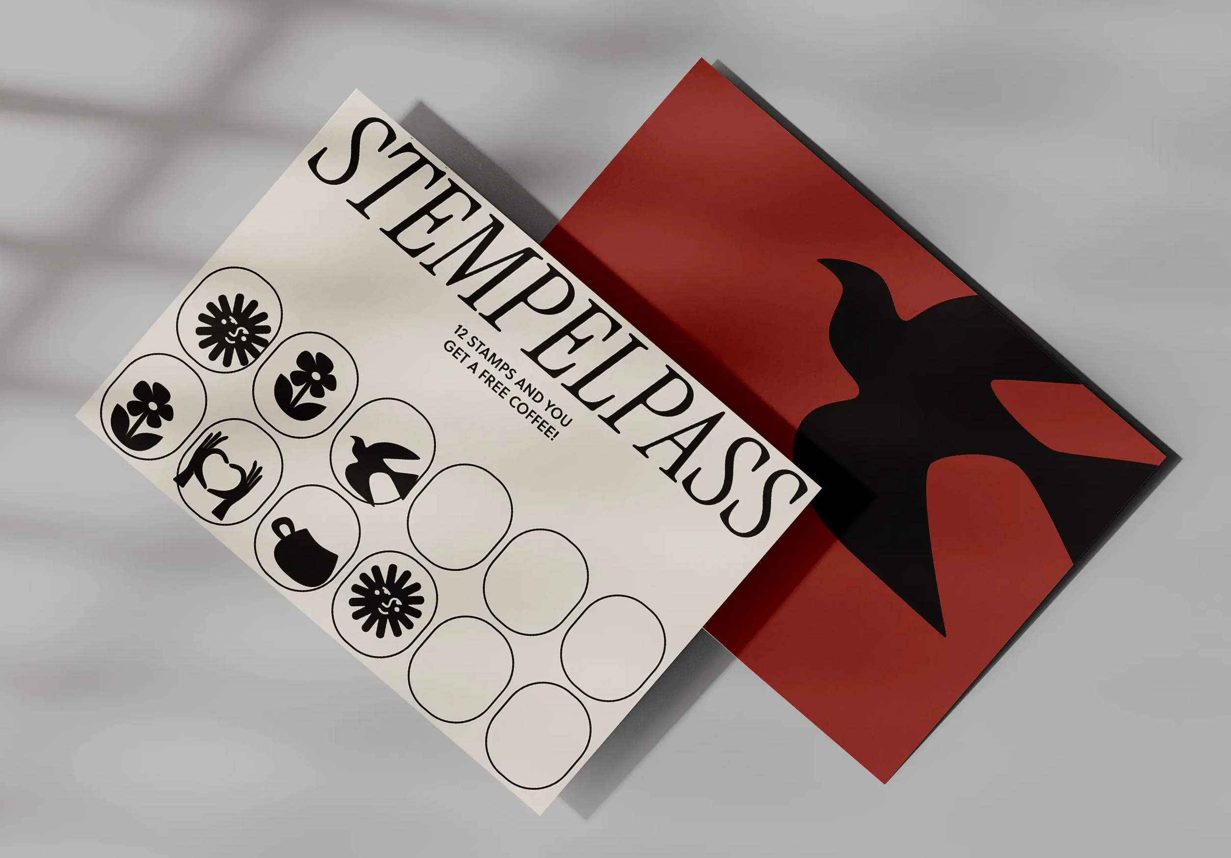
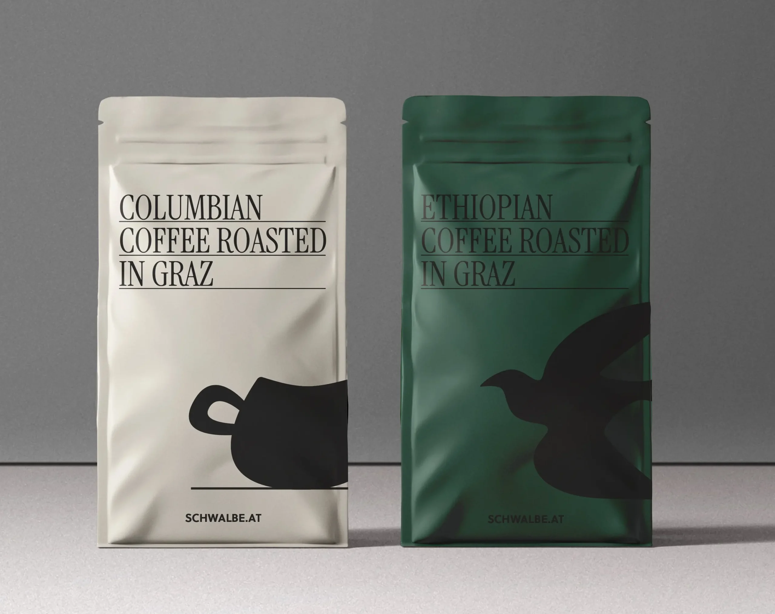
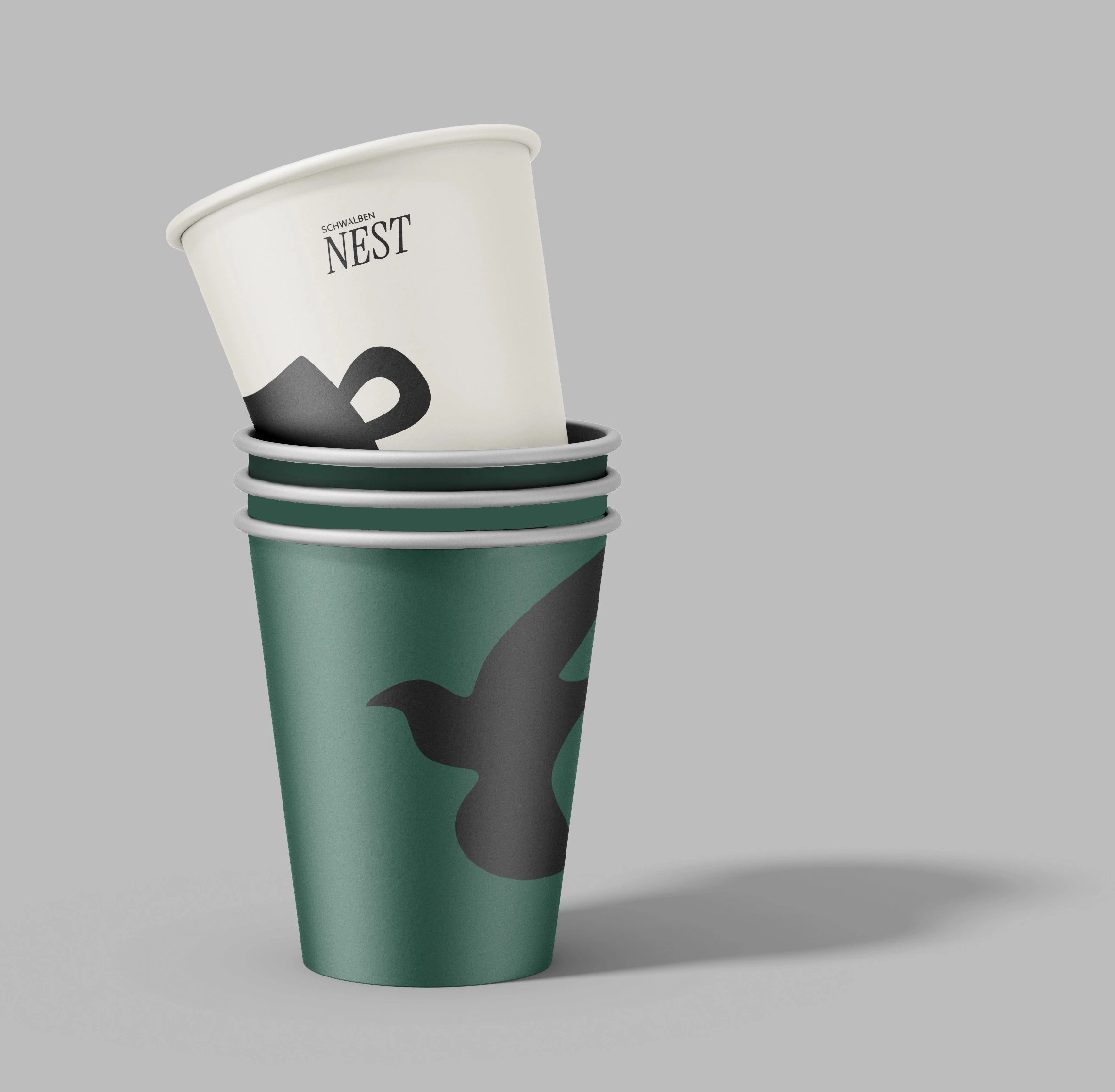
The Rebranding should represent the tradition of the Café but still feel modern and classy. In a research beforehand that I conducted about the Café I found out the keywords that I needed to focus on for the Rebranding: Slow Food, Regionality, High Quality, and Cozy Atmosphere.
Based on this research I decided to work with illustrations created for the “Schwalbennest” which should feel like stencils, sturdy not too delicate to create but still fun and friendly. For the fonts, I decided to go with a traditional but still modern tall serif font paired with a contemporary sans serif for copy texts. The colors of the branding were created based on the building itself and can so easily be connected with it.
Impressum & Datenschutz/ © 2021 Laura Elisabeth Bauer


